Big order!
Hey! sorry for the lack of update last week but as the title says, i had a big order in from a company named “Avraham, advertising and Marketing” they wanted to enter a competition at Cannes for advertising by creating several “Golden Fish” ads. It means that these ads are not real they are created with the approval from the real costumer/company and it’s suppose to be very artistic.
Did you watch Madmen? if so, you Def remember the sketches,
I made some:

this ad was approved! later you’ll see the final outcome. This is an ad for Volkswagen.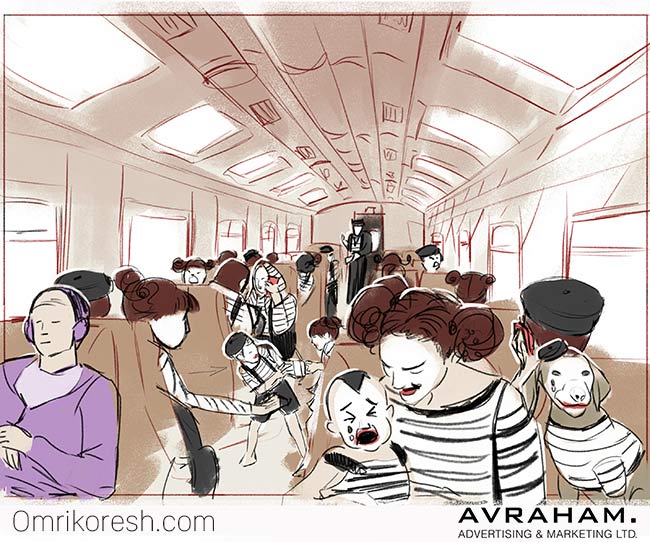
also approved! but they changed the angle of the “shot”. Ad for Sony, their headphones block sound.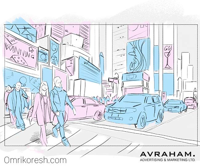
This is an ad for an Israeli company “Shilav” who sell baby clothes.
An ad (i think) for Seat, For their safety breaks, wasn’t approved but something else did.
This was a BIG ORDER. Big big order. One of these took me 30min-1h and i made total of 10! and also there were the
Actual ads that were approved, 3 in total.

They told me that they prefer the cars to be in the Same height and have “Space” around them. I wanted the cars much larger and in different heights, something that will resemble more a Carousel then this really clean illustration. I might change it to what i wanted if I’ll decide it’s good enough to go in my portfolio.

This is the complex image from this big order. The mimes from Sony. Yea i used stock images from shutter-stock for all the people but i still had to paint all the background and all the outfits and at the end paint on top of everything to make it seem like it’s a “Painting” they wanted me to push it towards Painting and not a clean illustration. Originally we put a guy sitting at the red chairs with his back to us, the client didn’t like it so we ditched him.

Last one! yup, big order. Seat’s break system something, the tattoo has elements of death and well, more death. the concept is that if you’ll use Seat’s safety thing, you’ll avoid death. i hate Hebrew text on tattoos /: English has swirls and it looks so sexy! Hebrew can’t have swirls, it doesn’t work well with the fonts. In Hebrew you don’t have capitals but you can have like “manual” writing and “print” these fonts are “Print” and THEIR graphic designer wanted me to put my own twist on the Print version. Swirls and stuff on the text just-doesn’t-work. It might work on Manual writing but again, in Hebrew you don’t connect the letters (unlike English and Arabic) so it just looks like a jumble.
New painting underway:

didn’t have time to paint on the candy and her palm looks so bad right now. She’ll be great when i’ll finish it though. I’ll give her some texture on the shirt and i want her to have fingernails that kinda look like candy. I like her features.
So this is the update for this week, got some more but i always pick one topic to update you guys on!
Thank you for reading, you can comment back on this email OR ON SITE HERE.
Omri.